A website on tools (http://toolemera.com/Books%26Booklets/booksplans.html) offers a page with antique booklets, one of which is titled, How to Make Woodwork Tools http://toolemera.com/bkpdf/haywardhowtobk.pdf.
This 52-page book, from around 1945, has strong illustrations outlining the various processes. True to form it has an initial illustration of the completed item and then multiple images showing the stages of the creation of the tools. The fact that this book is more than 60 years old proves that good design is timeless.
On My Way to Something New
Friday, April 22, 2011
Friday, April 15, 2011
Show & Tell 7
I shop regularly on the Internet but don’t necessarily visit non-store websites. One place I do go, however, is to dc.gov. This site’s strong navigation system makes it work well. The main divisions at the top allow you to choose where to go based on your point of view as a resident, a business, or even a visitor. Additional navigation menus allow you to click on what you are interested in finding. And the very best feature, of any website, is the search feature.
I think the sight has so much information to provide that it is not necessarily visually appealing but it is not unappealing either. They do a good job of using rules to divide the pages.
Friday, April 8, 2011
Endangered Species Chocolate Bars
Stroll down the organic food aisles of your grocery store and you are likely to find Endangered Species Chocolate Bars. True to the name of the chocolate, each bar type represents a different animal that is an endangered species. Aptly named and simply designed, the outer wrapper pictures an endangered species. The inner wrapper educates about the species.
Their website, chocolatebar.com, states the following regarding the All-Natural Dark Chocolate with Raspberries bar which features a grizzly bear:
"Increase your knowledge of hibernating giants by reading the inside of the wrapper, filled with insightful knowledge about grizzly bears, an at-risk species. Your chocolate purchase tastes all the more sweet knowing that it is supporting conservation efforts."
Friday, April 1, 2011
Cystic Fibrosis Foundation's Electronic Postcard
It has taken me a lot of work to find a postcard (without visiting the same websites as my classmates). At last I have found one, albeit an electronic postcard. This one is invitation to participate in a fundraising walk for the Cystic Fibrosis Foundation. The design is fairly simply but direct and straight to the point. What would be the mailer side is standardized text that the sender has the ability to edit.
Folgers: Classic and Gourmet
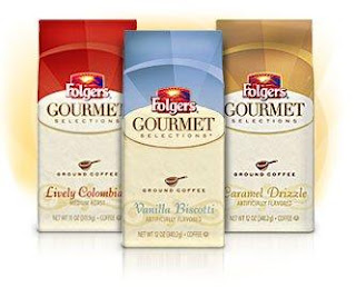
Classic and Gourmet Folgers Coffee
Classic Folgers comes in a very sturdy, reusable container designed to be your go-to, on a daily basis, coffee. It has hand grips and a snap on lid. It’s packaged in primary (Christmas) colors, a can’t-miss on the grocery shelf. And the ability to reuse the container means it’s in your house as a constant reminder of your day to day coffee.
The packaging for Gourmet Folgers is a reclose-able bag. Its daintiness implies something to be treasured. Though it has the same sunshine image (in both the traditional image and implied in the color band at the top of the bag) the design is very different than the Classic bag and is streamlined. The smaller quantity and different packaging implies gourmet.
Friday, March 11, 2011
Show & Tell 5
Here is a campaign from onepercentfortheplanet.org. They describe themselves as "a growing global movement of 1402 companies that donate 1% of their sales to a network of 2,414 environmental organizations worldwide."
In this particular example there is only one image. I think the lack of images reflects on the goal of the organization: supporting the environment. Thus the one image is an example of only using what you need to use. The image directly matches the title of the advertisement. The only contact information listed here is a web address; a presumed attempt to lead you to a source that the organization must feel has all the answers to any questions you may have.
I like this particular ad because though the title references dolphins, we recognize (before reading the copy) that they are referring to the human race.
Saturday, February 19, 2011
Get Up. Go Volunteer.
This campaign for volunteering shows that volunteering is a simple activity that anyone can do. The plain white shirt that the man is wearing is the sign that volunteering is an uncomplicated act. The designer also used a modified word cloud design to get the point across. And the word cloud tells us exactly what we can do. This advertisement succinctly gets the point across.
Subscribe to:
Posts (Atom)


